All Resources
R-04
Technology
User Research Methods That Actually Work in 2025
Effective user-research techniques that uncover real user needs and drive meaningful design decisions.
PAR2 Labs
February 20, 2026
6 min
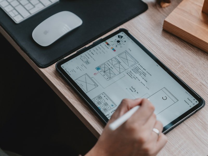
Design is not how it looks; it's how reliably it helps someone do the thing they came to do. Everything else is decoration in search of a purpose.
01
Pay the user's cognitive bill
Every decision you ask a user to make has a cost. The best interfaces pay as much of that bill as possible on the user's behalf: clear hierarchy, obvious defaults, one primary action per moment.
Cognitive psychology gives us the rules; relentless testing tells us which ones actually hold for this product, this audience, this moment. Both are non-negotiable.
02
Hierarchy does the heavy lifting
Before colour, before motion, before a single pixel of polish, hierarchy decides whether a screen is usable. Where the eye lands first, second, and third is the whole game.
We design the grayscale wireframe until it is unmistakable, then add the brand layer. If it works in flat gray, it will sing in full colour.
03
Motion with a job
Animation is not decoration — it is communication. Good motion confirms an action happened, shows where something came from, and guides attention to what matters next.
Every transition should justify the attention it asks for. When motion has a job, the interface feels alive; when it doesn't, it just feels slow.
If it works in flat gray, it will sing in full colour.
04
Designing for the stressed user
A calm user and a rushed user are effectively two different people. Under pressure, attention narrows and patience evaporates — and that is exactly when most interfaces are used.
We design high-stakes flows for the stressed version of the person: fewer choices, larger targets, unmistakable next steps, and forgiving error states.
05
Accessibility is just good design
Designing for the edges makes the centre better. Captions help in loud rooms, high contrast helps in sunlight, and clear focus states help everyone navigating in a hurry.
We bake WCAG thinking into the system, not a final-week audit. Inclusive products simply reach more people and convert better — accessibility and ROI point the same way.
06
The bottom line
When an interface is legible and predictable, people act with confidence — and that confidence is measurable in engagement, completion, and revenue.
We design experiences that pay the user's cognitive bill, so the product feels effortless and the numbers follow.
Key Takeaways
01
Pay the user's cognitive bill: clear defaults, one primary action per moment.
02
Use motion only when it communicates — confirm, orient, or guide.
03
Design high-stakes flows for the stressed user, not the relaxed one.
04
Build a system, not screens — components are a force multiplier.
PAR2 Labs · Technology
Work With Us